Dung Le

Prescriber Point Data App
The web portal report for Prescriber Point’s clients is designed to be separate from the main Prescriber Point order drug app. However, it shares the same design system and brand identity as the main app.
Analysis
Understand customer requirements and discover the app
01
Current situation
My client regularly delivers comprehensive data reports to stakeholders by utilizing Tableau for data visualization. As the data source is not real-time, there is a need to export the data into a PDF format for distribution.
03
Current situation
Certainly, the following tasks need to be addressed: I must conduct the user experience (UX) layout in accordance with the provided PDF brief to fulfill the project requirements. Furthermore, I will establish the Design System and Components and proceed with designing the user interface (UI) layout.
02
Solution
Build up the web portal adn extract live data from tableau
Each clinic will have an account to access their prescription data
04
Gain
Data is synced and live updated.
Easy for each clinic can access the data they need,
Stakeholders can access live data anytime they want. We do not need to care about the PDF exporting schedule.
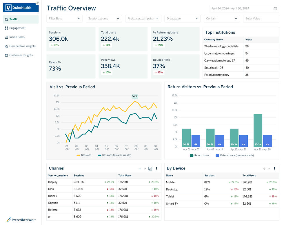
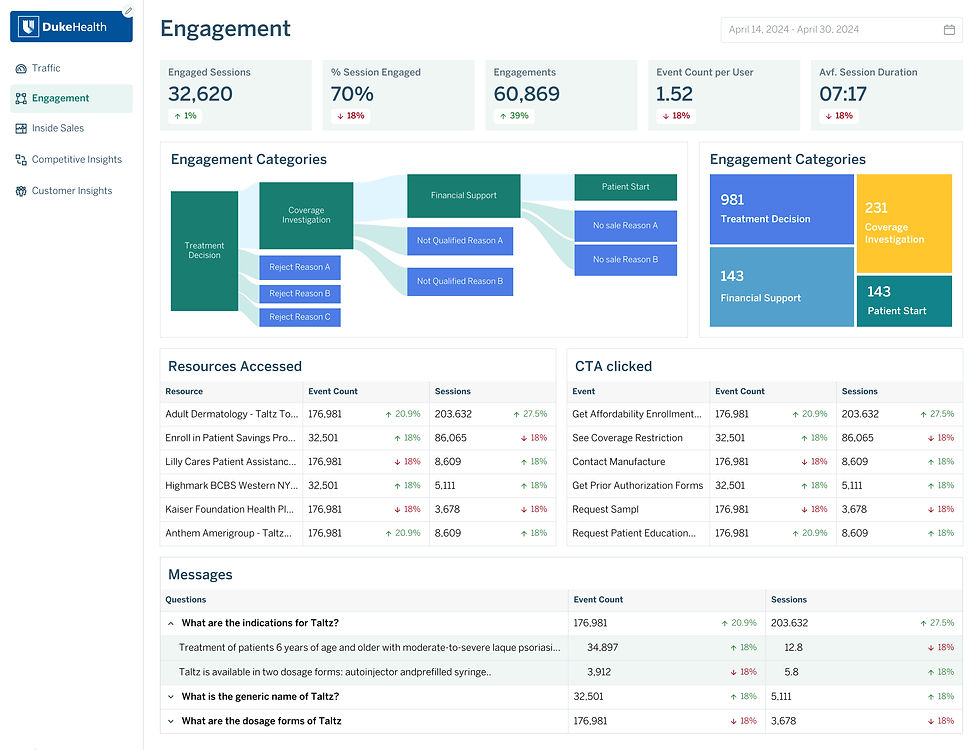
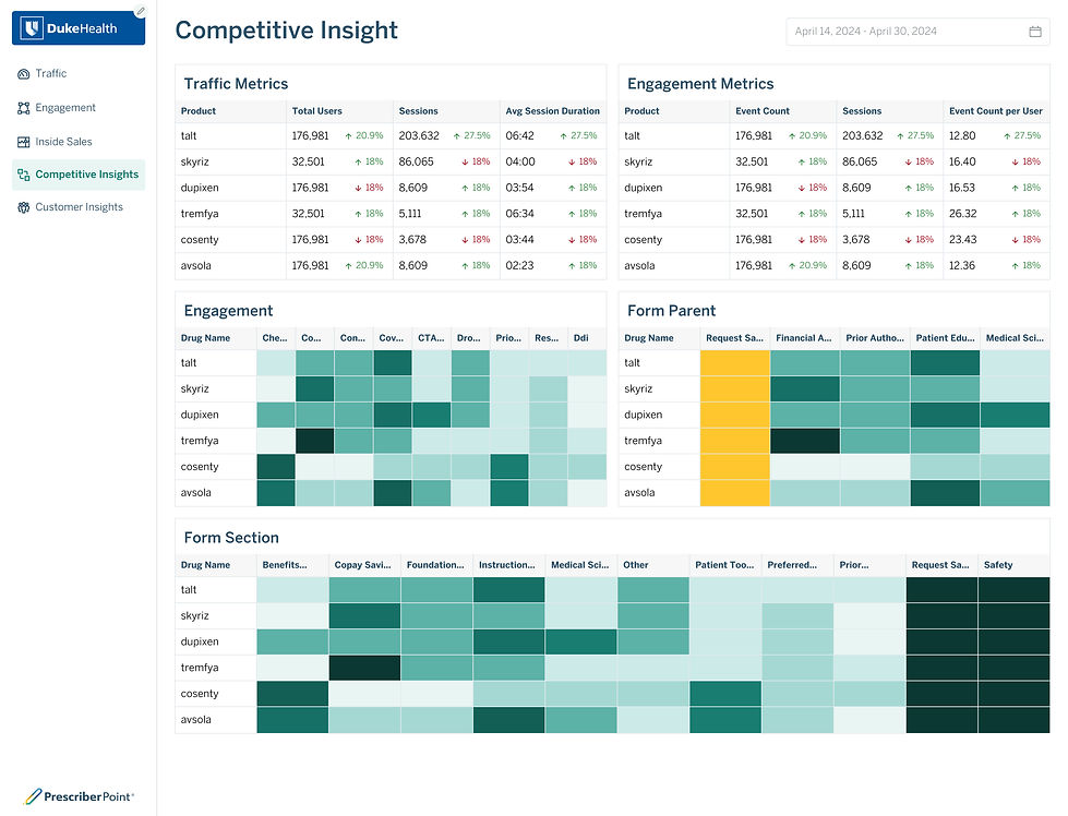
The current report file


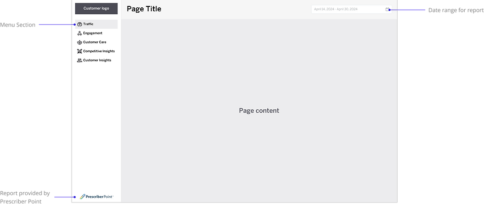
Proposal Wireframe
Compact Design System
Spacing System
This web application, designed for data reporting purposes, employs a 4-pixel ladder spacing system that follows a progressive doubling pattern. It is an extension of the primary Prescriber Point App.

Typography
The main app font is BentoSans. This is a digital font which is suitable for web and app environment.

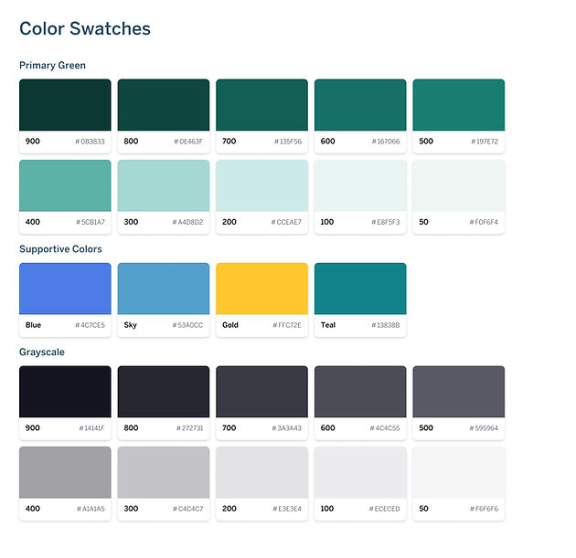
Color Swatches
In adherence to the brand guidelines for both the app and Prescriber Point, the predominant color utilized is green. Supplementary colors are employed for auxiliary design elements, such as charts and illustrations.
Color Token
These tokens serve to differentiate between input text fields in the app (Type Token) and to indicate the background and text for an action (Status Token). The Heatmap utilizes a color set to display data visualization, with the colors mapping to a range from 0 to 100 percent.

Icons
Prescriber Point uses Material Design 3 Icons set as the main icon set.
-
Weight: 400
-
Fill: Off
-
Type: Rounded Outline
-
Grade: Normal
-
Size: 16px
Buttons
This button set delicates for desktop app with multiple level action

Navigation
Prescriber Point app needs only one level navigation. This is the main menu on the left side bar

Input
Text field includes various indicators supporting validating and selecting data

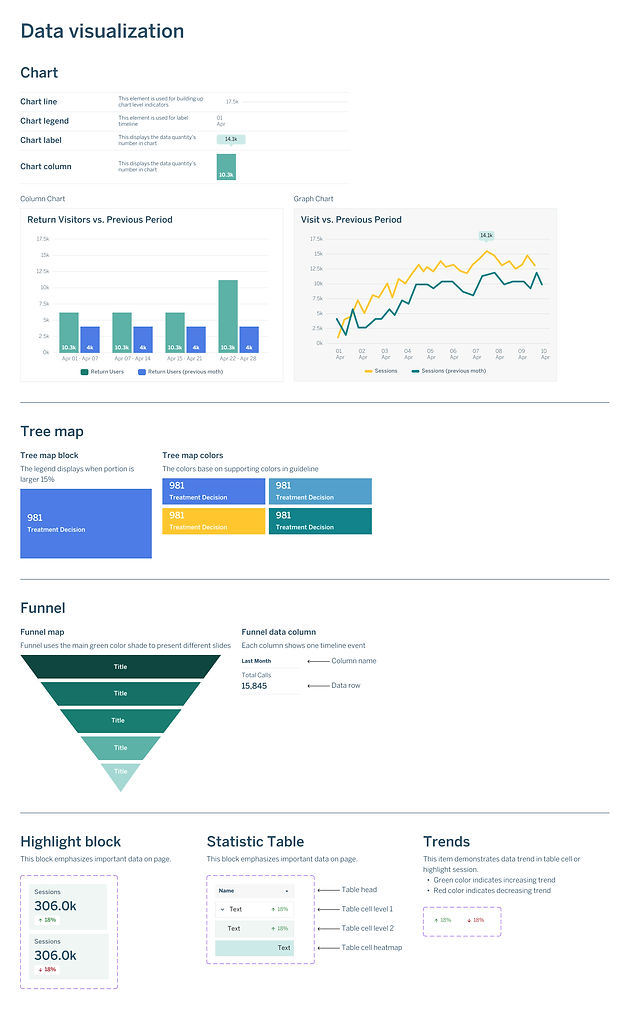
Visualization elements
A variety of standardized charts have been established to ensure consistency.
New layout